
Let's see what favicons and app icons are essential in 2022. Is it possible to use only SVG? How about icons with transparent background?

This is a supplementary article to my Progressive Web Apps (PWA) Explained Simply piece. I found a lot of conflicting information on this topic even in 2022. I generally don't like to link to Wikipedia, but this time one of the best articles on favicons is right there, but it still doesn't tell the whole story. We did a comprehensive research and came to the conclusion that you only need 8 different icons in 2022. Details below.
What browsers to take into consideration?
"The current joke among web developers is Safari is the new Internet Explorer"
Let's decide which browsers to take into account. Let's keep it simple. Is your client a geek or not? Not? So he's either on Edge (as a Microsoft's corporate user) or Chrome (because he/she has an Android), or, of course, Safari if he has a Mac or iPhone. Internet Explorer? Are you joking? Let's forget forever! If someone stayed on it, then he obviously does not need your PWA! Firefox or Opera? "Exotic" browsers? Well, your client, for some reason, knows how to install alternative browsers and will clearly understand how to open your application in another browser if he really needs it. Old versions of the listed browsers? Well then again, your client doesn't need your app, trust me. Therefore, we will only care about the latest versions of Edge, Chrome, Firefox, Opera and, unfortunately, Safari.
Favicon
We all know about those little icons for the website tab in our browsers - they are favicons. This is the first icon you definitely want to have for the page. Earlier, I already pointed you to one of the best articles about favicons. There is one good table under the heading "How to Use". It's absolutely true that we don't need favicon.ico anymore. Forget about placing these little things in your root directory. Should we use Apple specific rel="mask-icon"? Not! Why? Because it only supports very specific SVG. In 2016, there was a guideline from Apple that said which SVG would be accepted. We have tested. We found that this mask-icon tag is still in use, while the viewBox attributes and single color requirements are not really important, but the color setting in the tag is important, otherwise the tag is completely ignored. With the SVG of this particular requirement, you cannot use a colorful icon.
SVG only examples in meta tags + mask-icon
We left one website with that mask-icon option. You can open www.cecohome.com
You will see the following construction there:
<link rel="icon" type="image/svg+xml" href="/assets/andy/icons/cecohome_transp/cecohome-transp-regular-vector.svg">
<link rel="mask-icon" href="/assets/andy/icons/cecohome_transp/cecohome-transp-regular-vector.svg" color="ff600f">
You can check that this SVG is not like the 2016 guide but still works for Safari. This will not work if you remove this color tag. The same SVG file but placed in rel=icon will work in all other browsers - check it out.
This CECOHOME website is also an example that all icons (PNG or SVG) including the apple-touch-icon have a transparent background, so you can check how it works in both dark and light theme and in different places . I will talk more about transparent icons below.
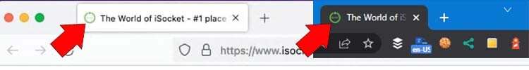
Maybe then use SVG for other browsers? Why? You'll need to maintain multiple favicons, and you won't actually get a smaller file or better resolution - the icon for a browser tab is very small everywhere. Do we need the full set of 16x16 px, 32x32 px etc.? No. We found that you can use one 48x48px PNG icon for all browsers. It will be about 2-4Kb only compared to 10-30Kb SVG and a bunch of different files. You won't get better quality by experimenting with anything else for the browser tab. So, we have the following solution, suitable for all browsers, yes, also for MacOS or iOS Safari:
<link rel="icon" type="image/png" sizes="48x48" href="/assets/icons/favicon-48x48.png">When you visit www.isocketworld.com you see this icon on the tab.
This approach also allows you to use a special icon just for the browser tab. The size is very small for a tab, and no special detailed drawings will be visible on the icon. However, other places use higher resolution icons so you can fit more details. For example, for the iSocket World catalog (link above), we decided to use an additional element - a book icon inside the logo. See our experiments below.
Other icon(s) for Apple
In this Apple guide, you can see 3 things you can do with a page opened in Safari: you can bookmark it, add it to your favorites, add an icon to your home screen. By the way, only the last option concerns PWA. There is a place number 4 - the header of the settings page when you click the "Share" button in Safari. We experimented with different looking icons and found that these places have nothing to do with either rel="mask-icon" or rel="icon", but they all need the following icon:
<link rel="apple-touch-icon" href="/assets/icons/apple-touch-icon-192x192.png">Here is the proof. When you visit www.isocketworld.com and click the share button in Safari on iPhone:
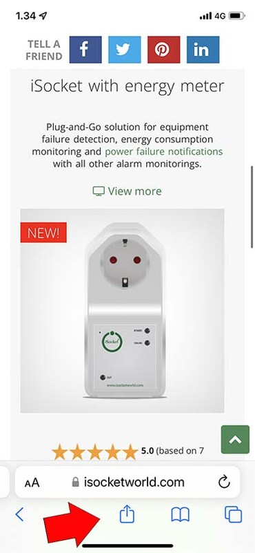
you will see this icon in the header:
Apple enforces heavy caching for the following two icons. I was never able to get out of this case, no matter how hard I tried - I reset Safari, rebooted the phone and many other tricks. I always had the old icon, and I still have it after a few months! So for this demo, I needed to use a remote emulator - it's actually like if I was using an iPhone that had never opened this website before. So, if you're wondering why you're seeing the wrong icon when you try to bookmark or favorite your site while developing an app, it's because of Safari. Yes, this new Internet Explorer is a headache for developers.
![]()
![]()
And here is the icon for the PWA (adding to the home screen will create a PWA). This one didn't cache much, and I got an updated one right away:
![]()
![]()
So a single 192x192 px non-maskable (explained in the next section) PNG icon that serves as an apple-touch-icon will do everything else for Apple stuff.
Icons for Android, Windows and everything else
Links to all other icons will be from the manifest file.
Read more about the manifest in my article Progressive Web Apps (PWA) Explained Simply.
Can we go SVG only?
I thought that we would be able to fully switch to SVG in 2022, but no, we can't. If you don't specify a PNG in your manifest, Lighthouse will complain about "Is not configured for a custom splash screen" and take you to these official Google guidelines, which clearly states that you need PNG 512x512px. Will this size alone be enough and can we count on scaling down? Perhaps. However, there is a link to this discussion, which ends with the conclusion that we need both 192px and 512px. Both links are mostly about the splash screen (the screen you see when you open the app), which probably means we don't need maskable icons of that size. But who knows? Another Google post about the manifest file also mentions both of these sizes. So from here we come to the following needs: 192x192 px + 512x512 px both maskable and regular.
Read more about maskable icons from Google, you can test your maskable icons here, but I personally prefer to work entirely manually and here is my post on how I automated icon development.
So, what about SVG?
Yes, we want to add SVGs too, and it's up to all other browsers to decide in the future what to do with those SVGs. The concept of putting SVGs along with PNGs seems to match the examples in the Google guide. So finally this means we want to put 6 icons in our manifest file.
Icons 2022 summary
I post useful information on my blog and share my experience for free. I don't post links to Amazon or anything like that. If my articles educated you, or maybe even helped you earn or save money or find a job, you can buy me a coffee.
Totally 8 icons:
48x48 px PNG non-maskable (all space is used) placed in rel="icon" to work as a favicon for tabs in any browser, including Safari.
192x192 px PNG non-maskable non-transparent placed in rel="apple-touch-icon" for all other Apple's stuff.
All of the following icons are for the manifest file for Android, Windows, and all other platforms and browsers that respect this file now or will respect in the future.
192x192 px PNG + 512x512 px PNG both maskable (marked as maskable in the manifest).
192x192 px PNG + 512x512 px PNG both non-maskable (marked and any in the manifest).
SVG maskable and SVN non-maskable icons.
Playing with transparency and layers is up to you for any icon and really depends on the structure of your logo and how you want it to look on dark and light themes. See the last chapter for more on transparency.
Tags for the page:
<link rel="icon" type="image/png" sizes="48x48" href="/assets/icons/isocket-green-R-transp-favicon-48x48.png">
<link rel="apple-touch-icon" href="/assets/icons/isocket-green-R-catalog-apple-touch-icon-192x192.png">
<link rel="manifest" href="/assets/pwa/manifest-isocketworld.json">
Icons in the manifest:
"icons" : [
        {
            "src": "/assets/icons/isocket-green-R-round-catalog-vector.svg",
            "sizes": "any",
            "type": "image/svg+xml",
    	    "purpose": "any"
        },
        {
            "src": "/assets/icons/isocket-green-R-round-catalog-regular-192x192.png",
            "sizes": "192x192",
            "type": "image/png",
    	    "purpose": "any"
        },
        {
            "src": "/assets/icons/isocket-green-R-round-catalog-regular-512x512.png",
            "sizes": "512x512",
            "type": "image/png",
    	    "purpose": "any"
        },
        {
            "src": "/assets/icons/isocket-green-R-catalog-maskable-vector.svg",
            "sizes": "any",
            "type": "image/svg+xml",
    	    "purpose": "maskable"
        },
        {
            "src": "/assets/icons/isocket-green-R-catalog-maskable-192x192.png",
            "sizes": "192x192",
            "type": "image/png",
    	    "purpose": "maskable"
        },
        {
            "src": "/assets/icons/isocket-green-R-catalog-maskable-512x512.png",
            "sizes": "512x512",
            "type": "image/png",
    	    "purpose": "maskable"
        }
    ]
This is how DevTools sees icons (you don't have to worry about non-maskable ones being clipped when you check the “Show only the minimum safe area for maskable icons” checkbox).
![]()
![]()
Icons With Transparent Background
Is it possible to use icons with a transparent background or not? Technically, this is not prohibited. Should you use it or not? I'll show you how they behave and it's up to you whether you treat it as a bug or a feature. You can check it out for yourself at www.cecohome.com, where we left the transparent background icon you see in the experiments below.
This is the Android app installation prompt and dialog (the background of the icon is transparent, not black):
![]()
![]()
This is the splash screen and home screen (the only place where the background turns white instead of black):
![]()
This is the share button screen and add to home screen on iPhone X:
![]()
![]()
And probably the most annoying behavior when opening and closing an app on iPhone: