
Your Facebook cover photo is the large image at the top of your Facebook Page. This is the first thing your visitors see and depending on what they see, they will either decide to look further or not. A good Facebook Page cover photo should work well on both desktop and smartphones. Check how effective your cover photo is.

A couple of weeks ago I decided to relive the past and use Photoshop to update the cover photos on the social profiles of my company. I found it quite complicated to make a perfect Facebook cover photo that works on both desktop and smartphones. I hope the experience I share with you below will save you time and be useful.
The Facebook cover photo is the large image at the top of your Facebook Page. This is the first thing your visitors see, and believe it or not, depending on what they see, they decide whether to look further or not. So you need to make the cover photo perfect, don’t you?
The goal
To create an effective Facebook cover photo for your Page that is optimised for both desktop and smartphones and will lead to sales of your product, or at least further viewing of the Page.
Promotion rights
A few years ago Facebook didn’t allow the use of cover photos for promotion. There was a popular story about Pete Pachal and other Mashable staffers when their Facebook cover photos disappeared without any explanation. Later in 2013 Facebook removed the requirement that cover photos may not include images with more than 20% text – so called “20% text rule”. This rule still applies for images used for advertising, but not for the cover photo anymore. However, when users get to the “upload cover photo” stage, they get a warning popup that says “This space is not meant for banner ads or other promotions”.
It seems this only applied to personal profiles and, to be honest, I haven’t research current situation with personal profiles (let me know in comments section if you know) since this post is about Pages. The definition of “Facebook Page” you will find in their official help. As you see Page is about product, brand or organisation. Official Facebook Page Terms say that “Covers can't be deceptive, misleading, or infringe on anyone else's copyright. You may not encourage people to upload your cover to their personal timelines” and those are the only limitations for covers. You are obviously free to use your Page cover photo for promotion, include CTA (call to action), contact details, website and place as much text as you wish – but don’t be spammy.
So, let’s start.
1. Choose an original eye-catching photo as the basis
Yes, the basis. You don’t want to have just a cover photo, you want to create an effective cover photo that will help to sell your product. There are more elements than just the photo itself. I already mentioned CTA, website, etc.
What kind of photo?
The best photo is where people see your product or service. It’s even better if they can see it in action. If you have a complicated, or new, or original product and it is not obvious exactly what it does, try to be original – use a photo that catches the eye and visitors will want to learn more. How did I do this?
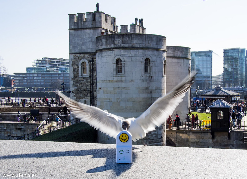
During a recent trip I caught this pic where a seagull was fascinated by our smart plug, with The Tower of London in the background. I think it’s eye catching, because it’s unusual. It doesn’t show the product in action, because it’s difficult to explain what our product does in one picture, so I decided to use another approach. See below.
What about using an abstract photo?
For example, you are a travel agency and you just want a nice landscape picture. That’s not bad, but don’t you have a USP (Unique Selling Proposition)? Try to show a USP in the form of a picture.
Hint: Use photos with smiling people - your service will be associated with happiness.
2. Choose the right size and format for your cover photo
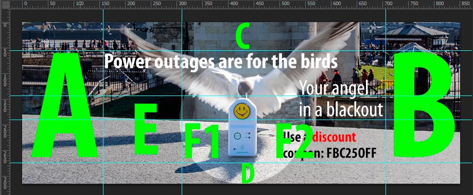
The dimensions for a Facebook Page cover photo are 851 pixels wide and 315 pixels height. Official help recommend you use less than 100 kilobytes for fastest loads, but here are some more pointers: If you upload a cover photo that is more than 100Kb, Facebook will apply heavy compression that you might not like. But if you make the output file less than 100Kb you can control the compression and quality of the final file in the software you use and you will get the same quality after you upload your cover photo on Facebook. Help says that for “cover photos with your logo or text, you may get a better result by using a PNG file”. This is again about compression. So far they have not applied compression for PNG files at all, but who knows when they might change this. I would recommend you use a JPG smaller than 100Kb. And of course cut the exact 851x315 pixels. Place the main object (your product) in the middle - the safest zone - see below.
So now we have the right cut of 851 pixels wide and 315 pixels high.

And here comes the challenge.
3. Make your cover photo suitable for desktop and smartphones
A Facebook Page cover photo is displayed differently on desktop and smartphones. Help says: “Displays at 828 pixels wide by 315 pixels high on your Page on computers and 640 pixels wide by 360 pixels high on smartphones”. As you can see it is more visible on desktop. But that’s not the only problem. The top of your Facebook Page has different elements – such as a profile picture, buttons, the name of the page and the category. All these are positioned differently on desktops and smartphones.
Desktop-only, smartphones-only or universal?
This is obvious - you can’t use the free space of your cover photo efficiently if you choose a universal format. If you focus on desktop only, you have quite a lot of space to place CTA and other text information without looking spammy because of too much text. If you decide to optimize your cover photo exclusively for smartphones, it might not be that efficient on desktop. What should be the main factor that helps you decide which way to go? It’s quite simple – it’s all about your target group and/or your product.
If your product/service is for mobile users or your target group mostly visit your Page from smartphones, then you might decide not to consider the desktop version at all. On the other hand, while some services may be tailored for desktop users or the majority of your target audience are desktop users, I do not recommend you ignore the smartphone version of the cover photo.
I decided to go for the universal option and the template for this option I share with you. Note, the template might not work the same way on all smartphones, but I tried to use safe dimensions with tolerances to make it workable on most phones.
You can receive the PSD template with the guidelines once you have subscribed to my blog here [link removed after I cancelled subscription because of GDPR].
So we have the exact cut of 828x315 pixels from step 2.
Forget about 160px from the left (zone A) and 128px from the right (zone B). These areas will not be visible on smartphones (see picture below). Place all information between 160-700 pixels by X. Keep the area of 55px from the top (zone C) free from any text – this area is allocated for search on smartphone and any text will be overlaid.
Leave a clearance of 45px from the bottom (zone D) – this space is used for buttons on desktops.
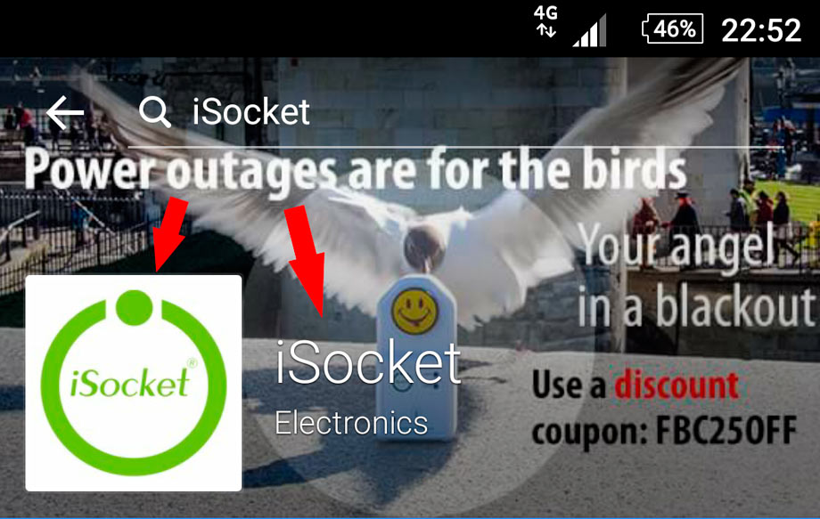
Don’t use zone E and F – these are reserved for your profile picture (e.g. logo) and the Page name on smartphones. For the desktop profile picture, Page name and category will be somewhere in zones A/E/D, which we have already decided to leave free from any text.
A few more notes about zone F: If you want to place text in zone F2 (and you DO! – see step 5), you must take into consideration the length of your Page name and category. In my case it was short and as you can see there is no overlaying. You must figure out the acceptable distance between F1 and F2 by yourself.
4. Place the problem you solve in the header of your cover photo
People buy your product because you help them to solve their problems. If a visitor lands on your Page with pain and he sees this pain mentioned right at the top of your Page, he will no doubt want to look for the solution you offer. And you might want to outline that solution right here on your cover photo. It would be better if your text works well with the background picture. Here’s how I did it.
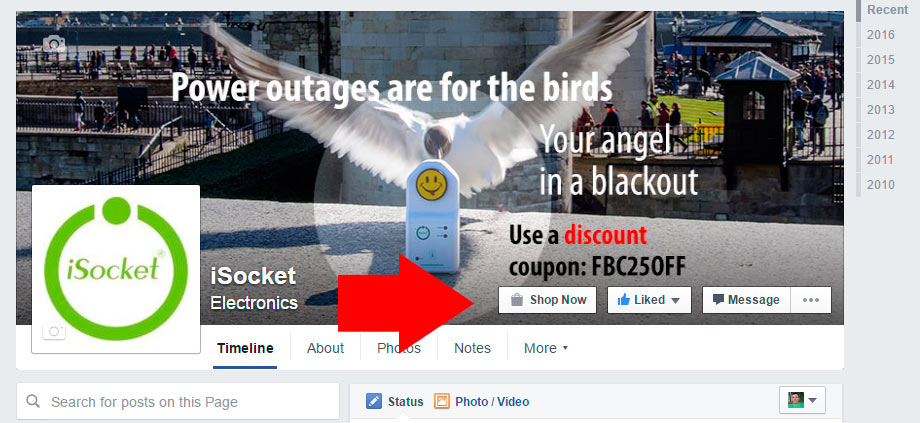
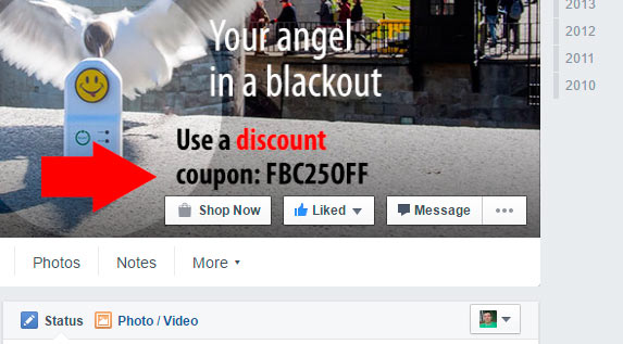
Our company provides a solution for a prompt notification about power outages. When the customer gets an alert about a power outage he can take corrective action, e.g. come back home or call the maintenance company to start a generator and avoid costly damage. The problem is “power outage”, to be more precise – the consequences of power outages, but it is ok to simplify to just “power outages”. Our product is a smart plug with cellular connection – iSocket 3G. This plug notifies when power fails. As you can see this is a bit complicated to show on the picture and that’s why, as I explained, I decided to choose an original approach – I decided to use a pun. Since most of my customers are from USA and the UK I assumed they will understand a play on words.
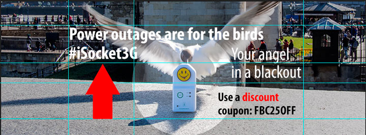
Since I had shot that great picture with the seagull I put “Power outages are for the birds” – meaning they are bad (simplified). Since, in the picture, iSocket seems to sprout wings, it looks like an angel – someone who saves you from a problem: “Your angel in a blackout”. Blackout is a widely understood synonym for power outages.
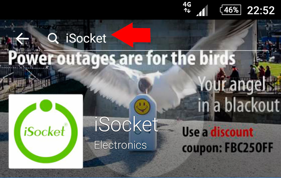
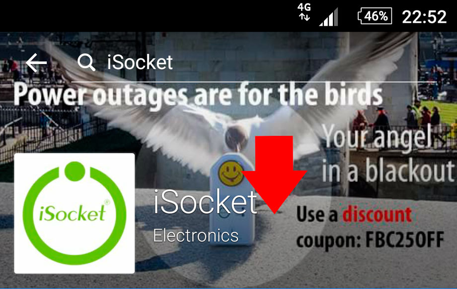
When a target visitor leaves your page – or it might have been an occasional visitor – he must remember the association: “problem – your product”. The Smartphone template works especially well here. See: “Power outages – iSocket”.
Can’t identify what problem you solve? That’s a problem. ;) I’m not going to cover this aspect of sales in my post, but if you can’t mention which problem you solve, at least tell visitors about your USP.
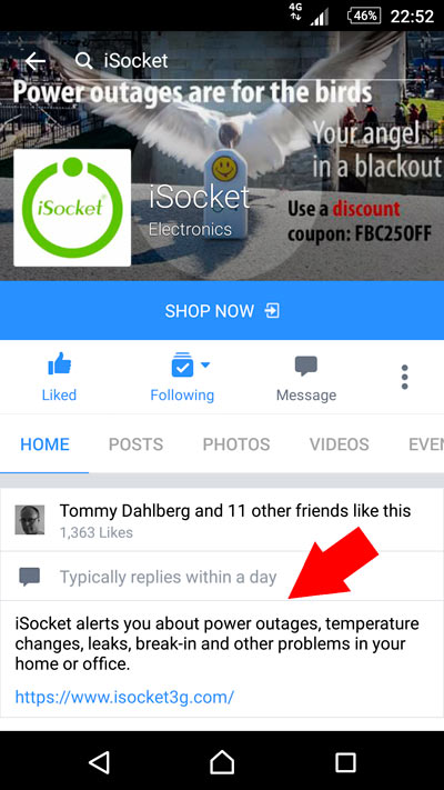
Too broad? Choose one of the problems you solve. That’s btw, exactly what I did. We are in smart home automation and our products solve different problems, but if our page told about smart home or about smart plugs (as it was before) then it would be difficult to be different and it would not show any problem at all. That’s why I focused on one problem – power outages. But you have the chance to tell more in the description to your Page. And again the smartphone template works very well, because the description comes soon after the cover photo and buttons.
5. Draw attention to CTA buttons
Facebook offers a great opportunity to show CTA buttons on your Page and you need to direct visitors to this button. You should do this, because, unfortunately, Facebook has not made this button according to CTA standards and not every visitor will notice this button.
Place your CTA in the F2 zone and this will appear exactly above the CTA button:
For smartphones it works like this:
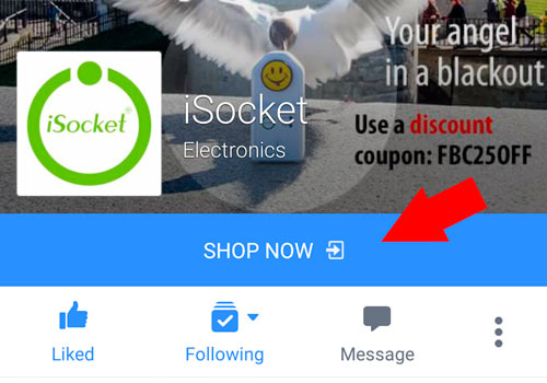
If you don’t want to insert any coupon or other text, I would recommend you draw an arrow pointing to your CTA button. This should work very well.
6. Highlight your product on the cover photo
You don’t want your visitor to spend a few seconds (that’s a lot!) searching your products on the cover photo, nor do you want him to think you’re selling tickets to the Tower of London. ;)
I used different opacity to direct focus to the product and highlighted the plug with a lighter circle.

7. Take gray gradient into consideration
The name of your page and category are always white and since Facebook doesn’t know what color background picture you will use, it applies gray gradient to your cover photo to ensure the white text is always readable. Keep this in mind, because your cover photo will be darker after you upload it. You may use this as a feature as I did (if you compare the original template with the final Facebook cover photo you will see that the white text is more readable on Facebook Page – that’s because of the extra gray gradient).
8. Hashtag
If you actively promote your product/service with hashtag you might consider placing it on your cover photo. I did it in one of the first versions, but then removed it because the current photo is already overloaded with text.
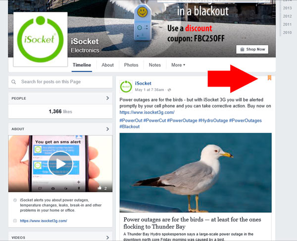
9. Pin to Top!
Another great tool Facebook offers you is the facility to pin any of your posts to the top of your Page. Make sure this post is a good continuation of your cover photo. That was one of the options I used.
That was just a basic guide. I don’t consider our new cover photo to be perfect, but that doesn’t stop you creating the perfect one for your Facebook Page using this guide. If you noticed some changes on Facebook rules or found any wrong information in this article, please drop me a line.
Let me know in the comments below what advice you found useful or new for you and which of them you plan to try. Share this post with your friends if you like.